By: Tyler Push, Sports Editor

Newman University is in a new conference, and the athletic department has decided it should also get a new logo to represent its teams.
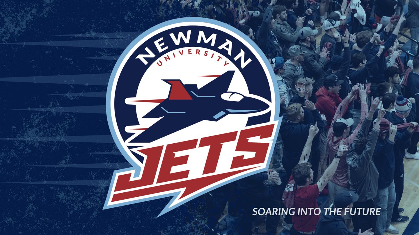
“Soaring into the Future'' was the name given to the rebranding project, which was led by Associate Athletic Director for External Operations Zane Ehling. Admissions Digital Manager Geoff Louvar designed the logo. The circle portion of the logo resembles past iterations of the Jets with the addition of a soaring jet in the center of the new emblem.
The process took nearly three years of researching, developing, and creating the new logo and mission statement, said Ehling and Louvar.
The new mission of Newman University athletics, according to Newman’s athletic website, is to empower students-athletes on the field to transform society off the field by adhering to a few core values: competitive excellence, investment in development, academic success, and serving others.
Athletic Director Joanna Pryor said she feels that “Soaring into the Future” gives the department a clear direction.
“It spells out what it means to be a Newman student athlete and how every coach and staff member plays a role in helping them make an impact while in college and beyond,” she said.
The project also came with a logo change, and it marks the first time that Newman has changed its emblem since the school was founded.
“It was just time for a refresh from a brand standpoint, and there was no better time than now with switching conferences,” Ehling said. “It was desired by a lot of different people, and in the last few years, there has been a really big push for something more modern, attractive and versatile.”
Louvar is credited with designing the logo. He received feedback from Ehling, Pryor, and various coaches on campus during the development.
“When I first started here, I noticed that nobody was really using the logo, and it looked outdated. So I just began to play around with different concepts,” Louvar said. “I am very happy with the positive reactions from the Newman community and student athletes when the logo was released.”
The logo will be put on new jerseys as they’re replaced and also will be displayed in key places in the gym and on athletic fields, Ehling said.
“We wanted to encompass what Newman athletics was but also give tribute to the university, Catholic heritage, and the sisters in it,” Ehling said.
Ehling described a 3x3x3 system that the “Soaring into the Future” project produced.
Three widgets are depicted in the word “Newman” to promote the university’s Catholic identity by symbolizing the Holy Trinity: the Father, the Son and the Holy Spirit.
In the word “Jets,” there are also three notches that represent the institution’s three names over the years: Sacred Heart, Kansas Newman College, and Newman University.
The new athletic logo consists of a jet powered by three red thrusters that resemble and honor Newman’s founding religious order, the Adorers of the Blood of Christ.
PHOTO: Courtesy Photo, Newman Athletics
